Intro to Data Visualization
visualization basics, ggplot2, grammar of graphics
2026-02-17
Data Visualization
What is data visualization?
- I’ve made charts and graphs that should finally make it clear. (I’ve prepared a lecture.)
- Graphical representation of quantitative information
- Identify, interpret, communicate patterns
- In academic research, data viz tells (not sells) a story
Core Principles
![]()
Clarity
Communicate all – and only – information necessary to tell the story
![]()
Simplicity
Minimize distraction & send one message at a time
![]()
Accuracy
Use reliable data (garbage in, garbage out) and be faithful to it
![]()
Consistency
Represent similar ideas in similar ways & meet audience expectations
![]()
Relevance
Know your audience & speak to them
Plotting with base R
- Base plots:
- “pen and paper” style
- easy to use, hard to modify
# First create the scatter plot
plot(iris$Sepal.Length, iris$Sepal.Width,
     main = "base R: Iris Sepal Length vs Width",
     xlab = "Sepal Length",
     ylab = "Sepal Width",
     col = as.numeric(iris$Species),
     pch = 19)

# Add regression lines for each species
species_levels <- levels(iris$Species)
colors <- 1:3

for(i in 1:3) {
    subset_data <- iris[iris$Species == species_levels[i], ]
    reg <- lm(Sepal.Width ~ Sepal.Length,
              data = subset_data)
    abline(reg, col = colors[i], lwd = 2)
}

# Add legend
legend("topright",
       legend = levels(iris$Species),
       col = colors,
       pch = 19)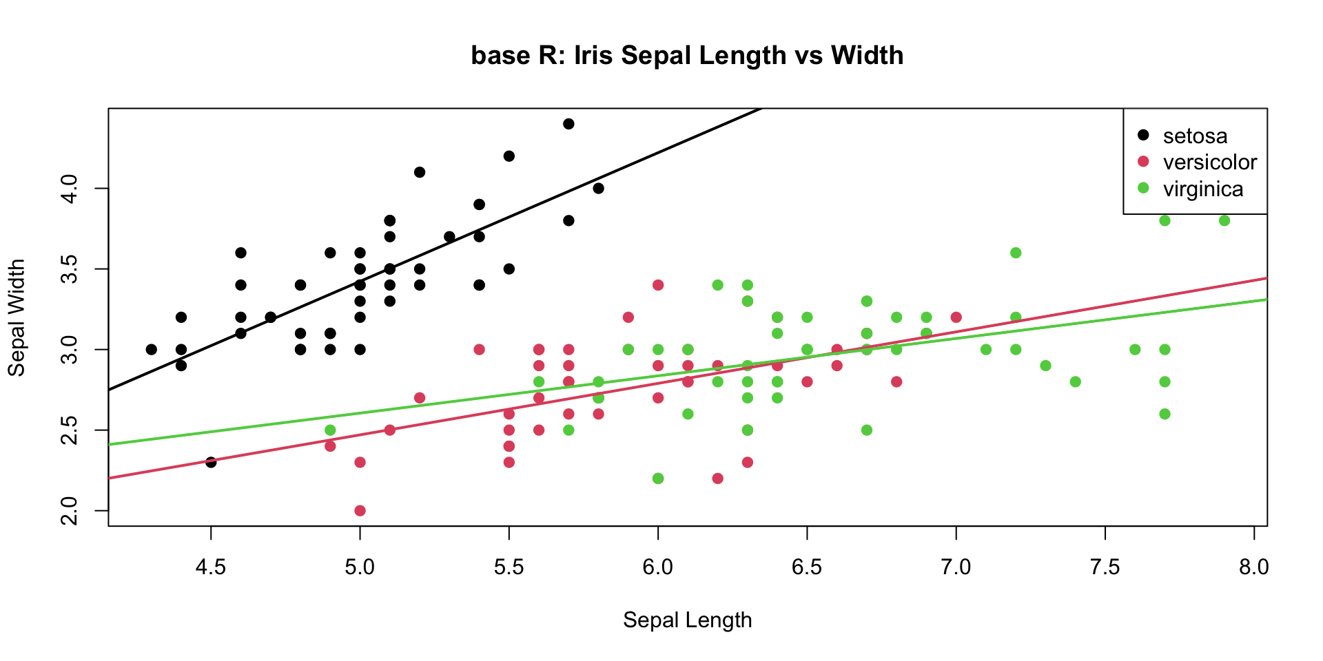
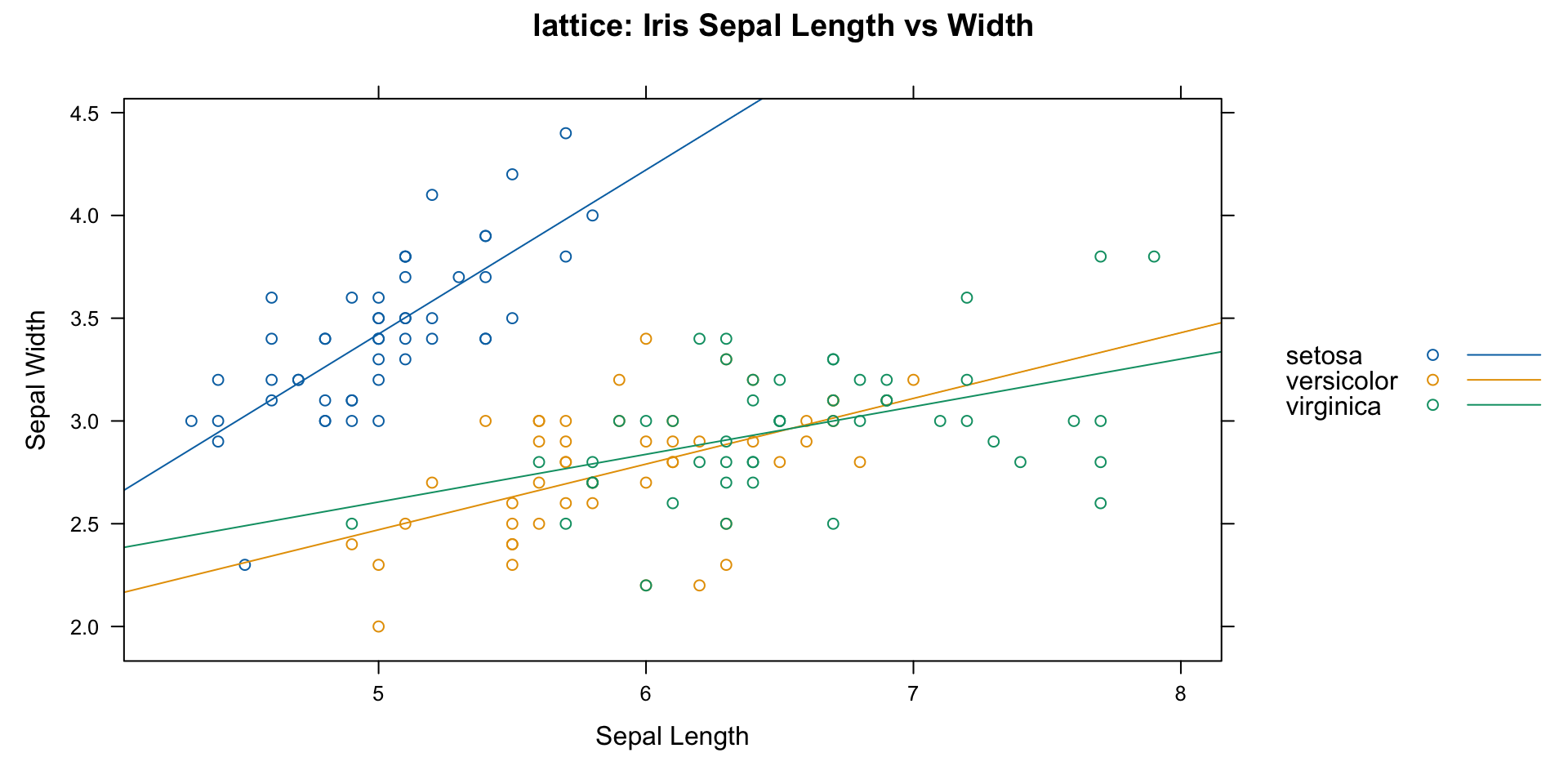
Plotting with lattice
- lattice
- lots of customization
- constrained structure
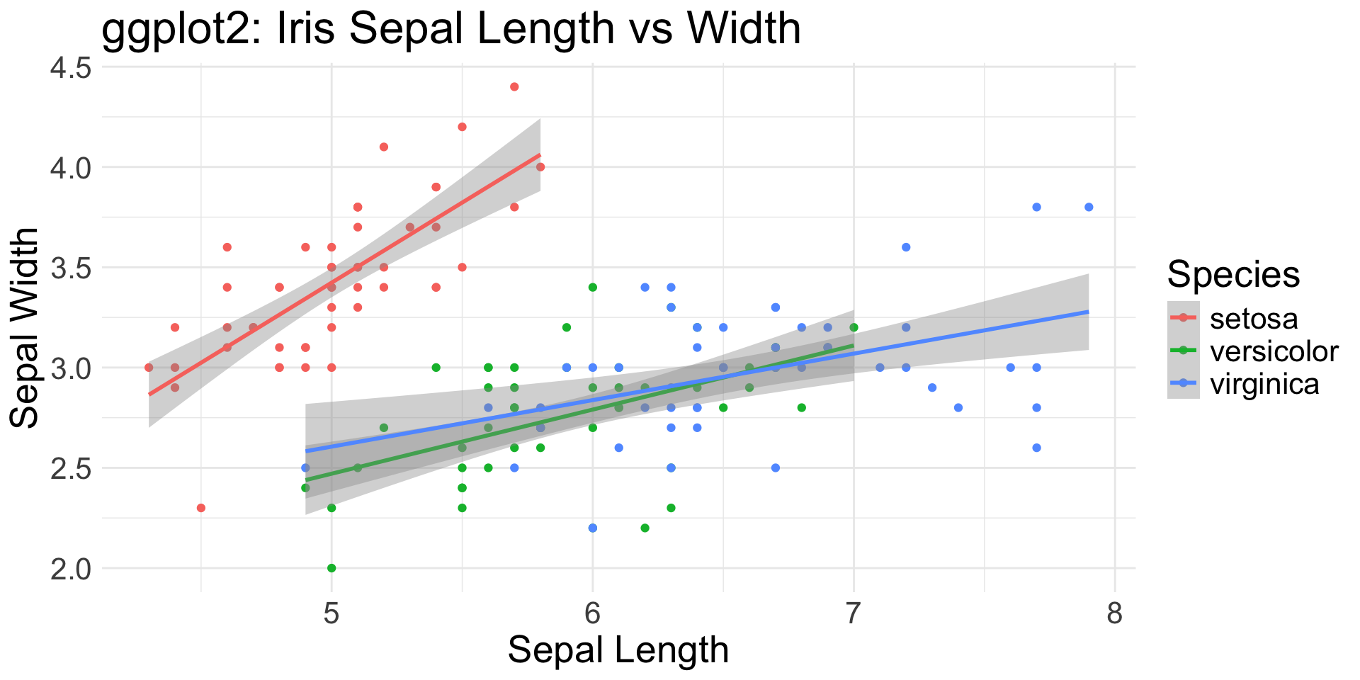
Plotting with ggplot2
- ggplot2
- flexible and powerful
- tidyverse approach to data science
Customization
ggplot(iris, aes(x = Sepal.Length, y = Sepal.Width,
                 color = Species)) +
  # Add points with custom appearance
  geom_point(size = 3, alpha = 0.7) +
  # Add regression lines with custom appearance
  geom_smooth(method = "lm", se = TRUE, alpha = 0.2,
             linewidth = 1.2, linetype = "dashed") +
  # Customize colors using a custom palette
  scale_color_manual(values =
                         c("#FF6B6B", "#4ECDC4", "#45B7D1")) +
  # Add labels with custom formatting
  labs(title = "Sepal Dimensions Across Iris Species",
       subtitle = "Comparing Length vs Width with Trend Lines",
       x = "Sepal Length (cm)",
       y = "Sepal Width (cm)",
       caption = "Data: Edgar Anderson's Iris Dataset") +
  # Customize theme elements:
  # title, axis, legend, panel, borders
  theme_minimal() +
  theme(
plot.title = element_text(size = 16, face = "bold",
                          margin = margin(b = 20)),
    plot.subtitle = element_text(size = 12, color = "grey40"),
axis.title = element_text(size = 10, face = "bold"),
    axis.text = element_text(size = 9),
legend.position = "bottom",
    legend.title = element_text(face = "bold"),
    legend.background = element_rect(
        fill = "white", color = "grey90"),
panel.grid.major = element_line(color = "grey90"),
    panel.grid.minor = element_blank(),
plot.background = element_rect(fill = "white", color = NA),
    panel.border = element_rect(color = "grey90", fill = NA)
  ) +
  # Set specific axis limits
  coord_cartesian(
    xlim = c(min(iris$Sepal.Length) - 0.2,
             max(iris$Sepal.Length) + 0.2),
    ylim = c(min(iris$Sepal.Width) - 0.2,
             max(iris$Sepal.Width) + 0.2)
  )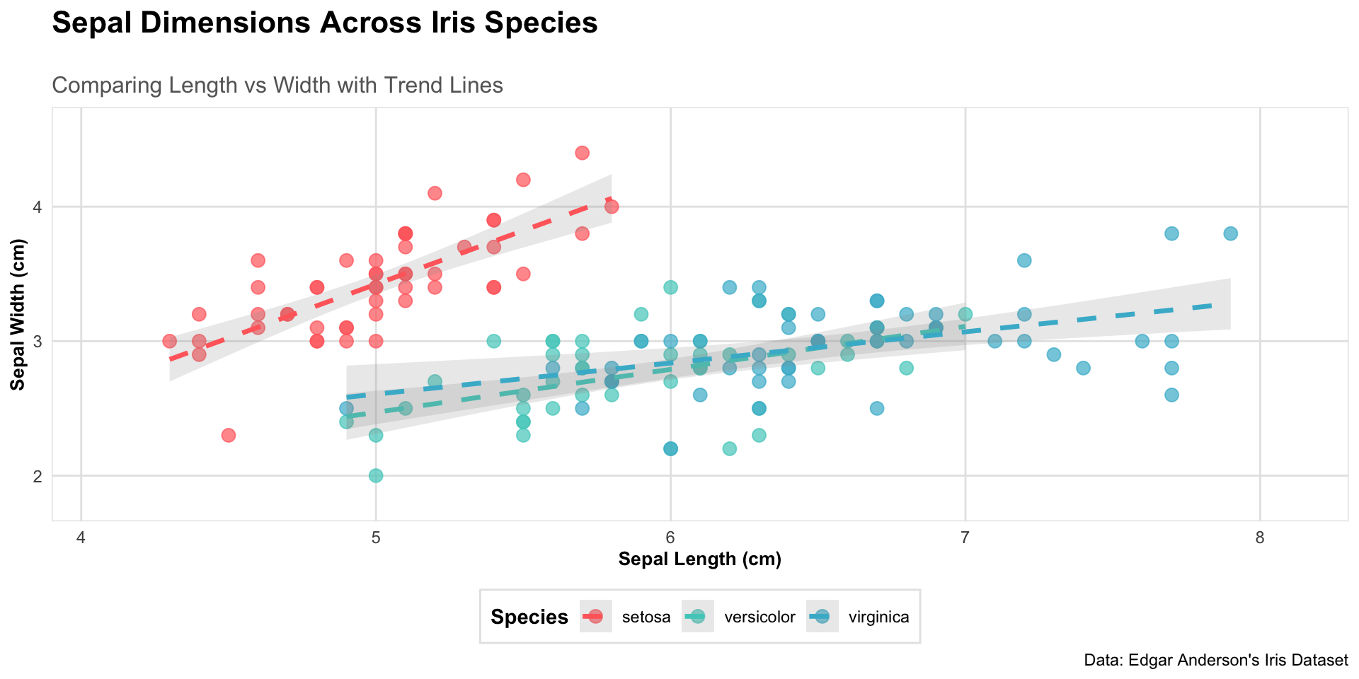
Flexibility
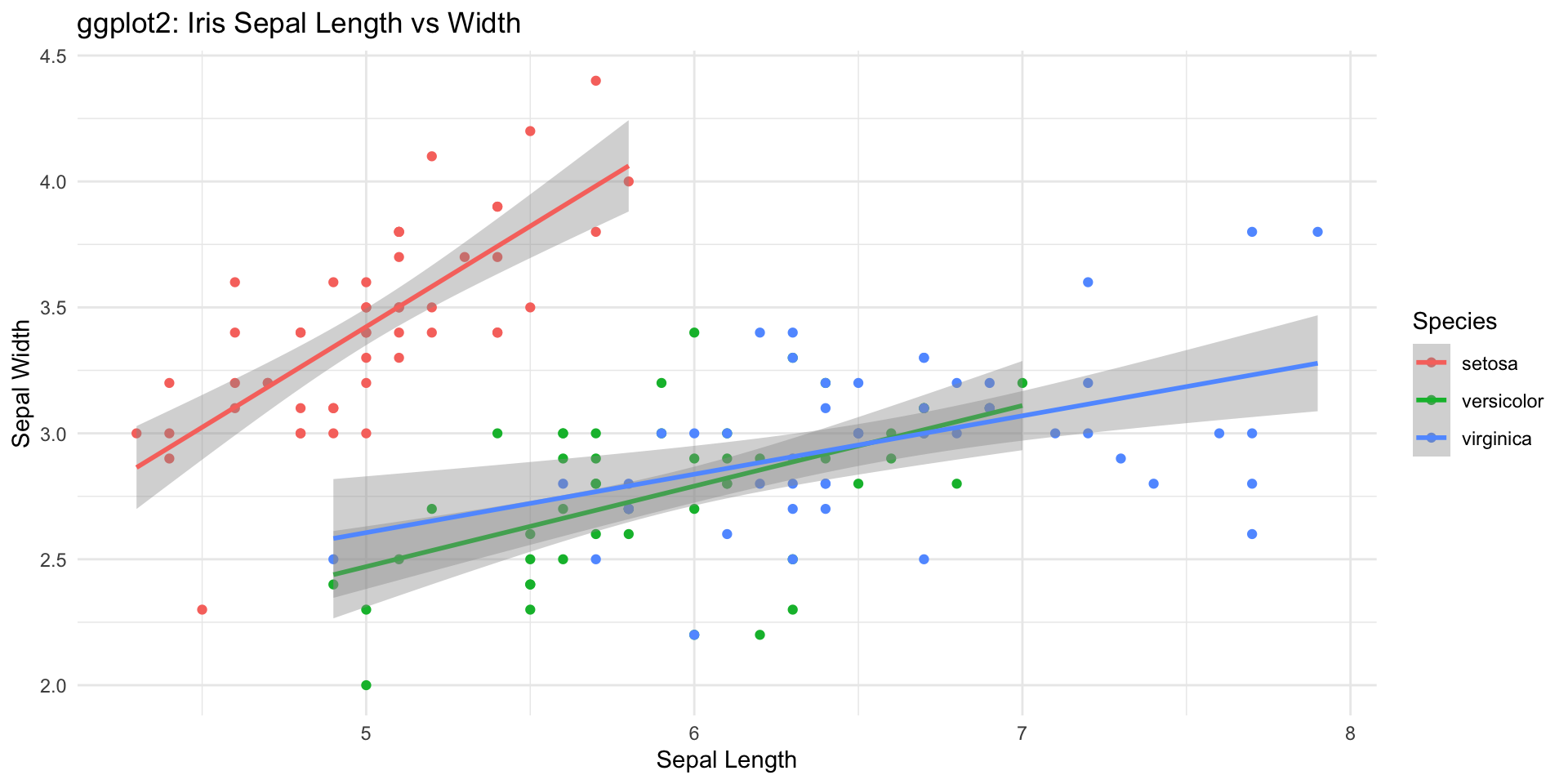
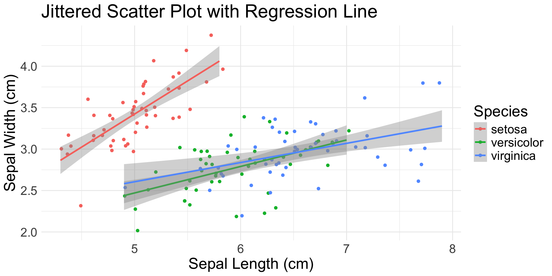
Iris Sepal Length vs Width: Scatter Plot + Regression Line
Flexibility
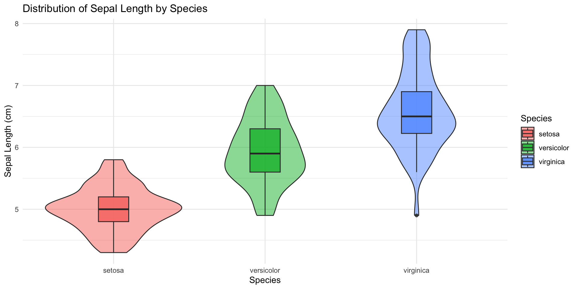
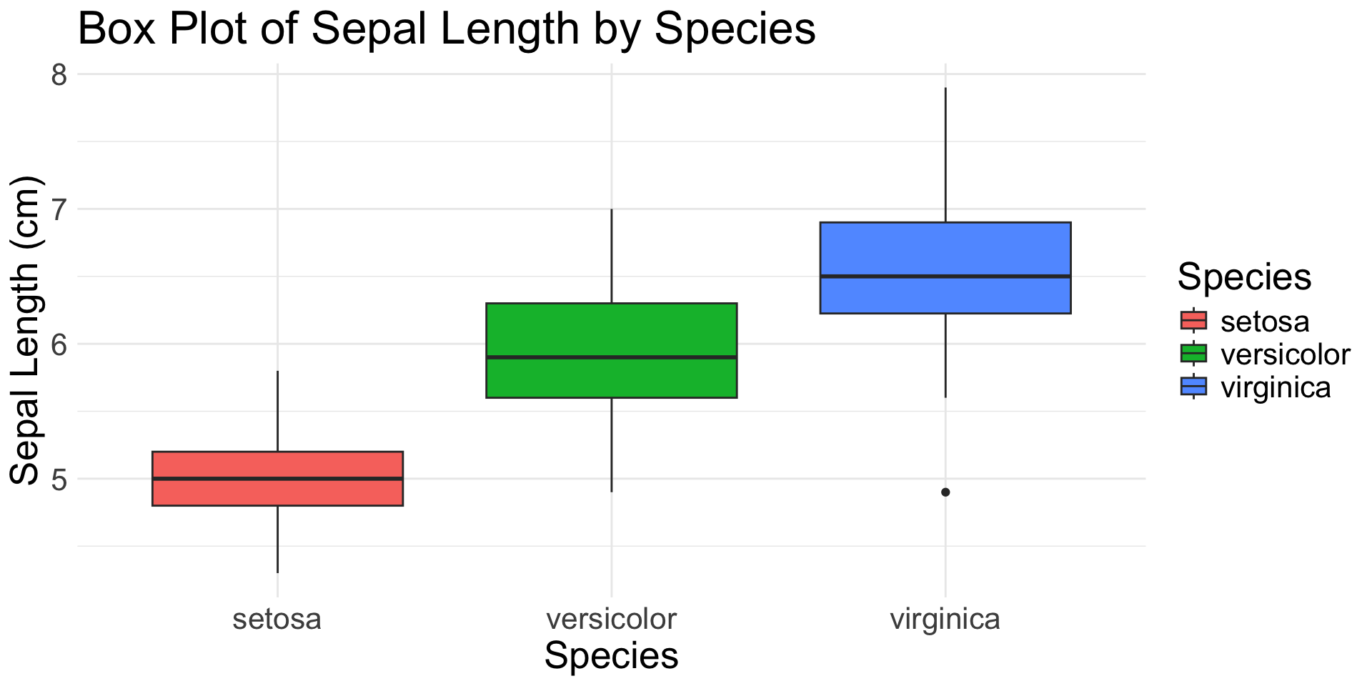
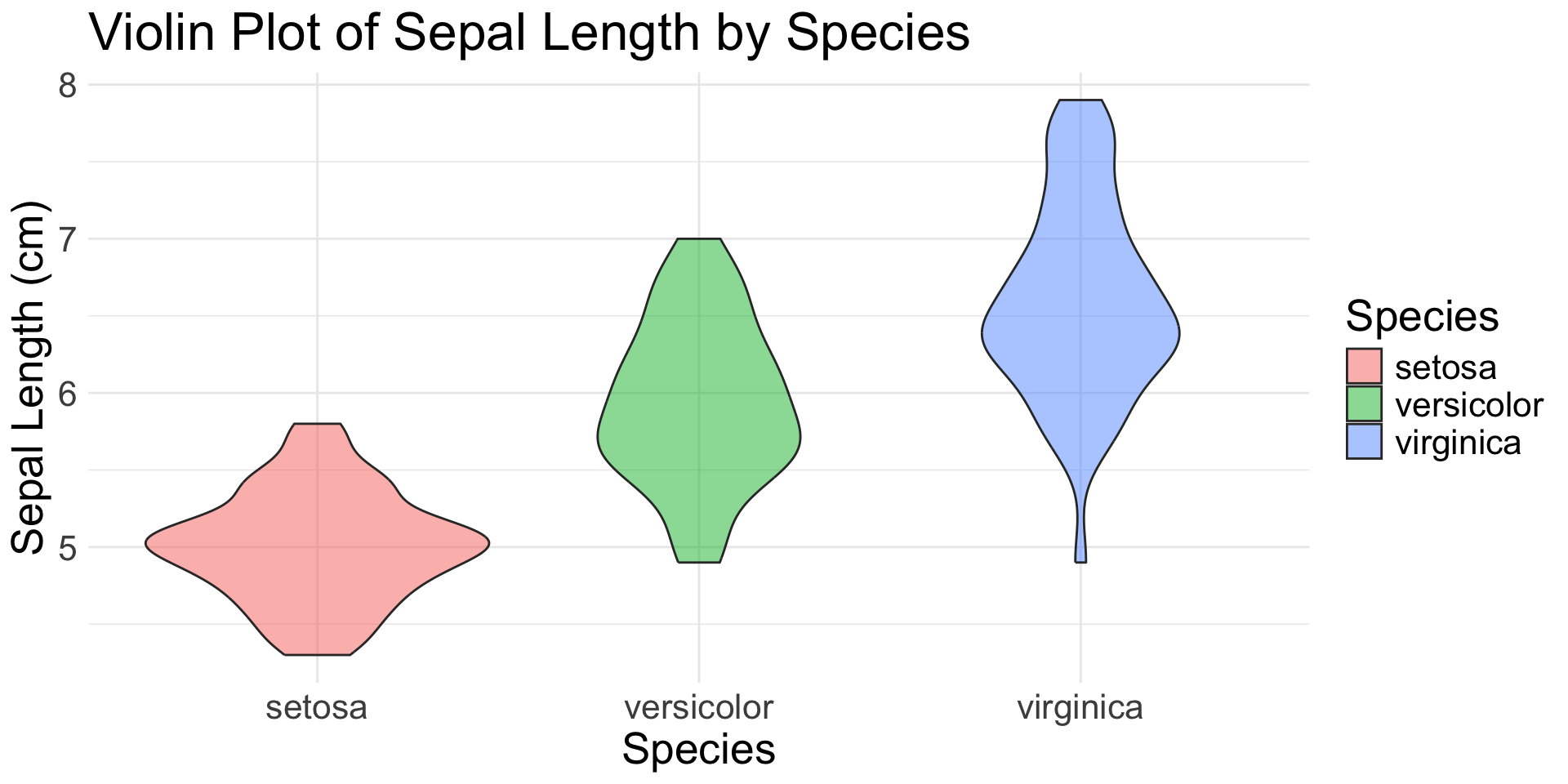
Iris Sepal Length by Species: Violin + Box Plots
Flexibility
Density Distributions of Iris Measurements: Faceted Histograms
pivot_longer(iris, cols=c(Sepal.Length, Sepal.Width, Petal.Length, Petal.Width),
    names_to="Measurement",
    values_to="Value") %>%
ggplot(aes(x=Value, fill=Species)) +
  geom_histogram(alpha=0.8, bins = 15, # histogram
    position = "identity") +
  facet_wrap(~Measurement, scales="free") + # subplots
  theme_minimal() +
  labs(title="Density Distributions of Iris Measurements",
       x="Measurement Value (cm)")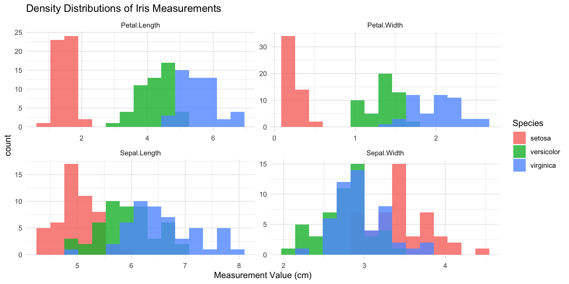
What do you need to generate this?

Layers
- Layers work together to plot elements
- Not all layers are necessary
- Each can have a powerful effect on outcome
ggplot(data = iris,                 # Data layer
       aes(x = Sepal.Length,        # Aesthetics
           y = Sepal.Width,
           color = Species)) +
  geom_point() +                    # Geometries
  stat_smooth(method = "lm") +      # Statistics
  scale_color_viridis_d() +         # Scale
  coord_cartesian(xlim = c(4, 8)) + # Coordinates
  facet_wrap(~Species) +            # Facets
  theme_bw() +                      # Theme
  labs(title = "Iris Plot")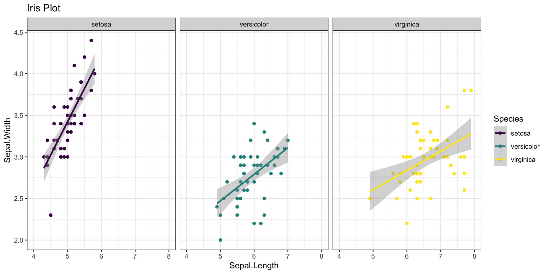
Layers
- Layers work together to plot elements
- Not all layers are necessary
- Each can have a powerful effect on outcome
ggplot(data = iris,                 # Data layer
       aes(x = Sepal.Length,        # Aesthetics
           y = Sepal.Width,
           color = Species)) +
  geom_point() +                    # Geometries
  #stat_smooth(method = "lm") +      # Statistics
  scale_color_viridis_d() +         # Scale
  coord_cartesian(xlim = c(4, 8)) + # Coordinates
  #facet_wrap(~Species) +            # Facets
  theme_bw() +                      # Theme
  labs(title = "Iris Plot")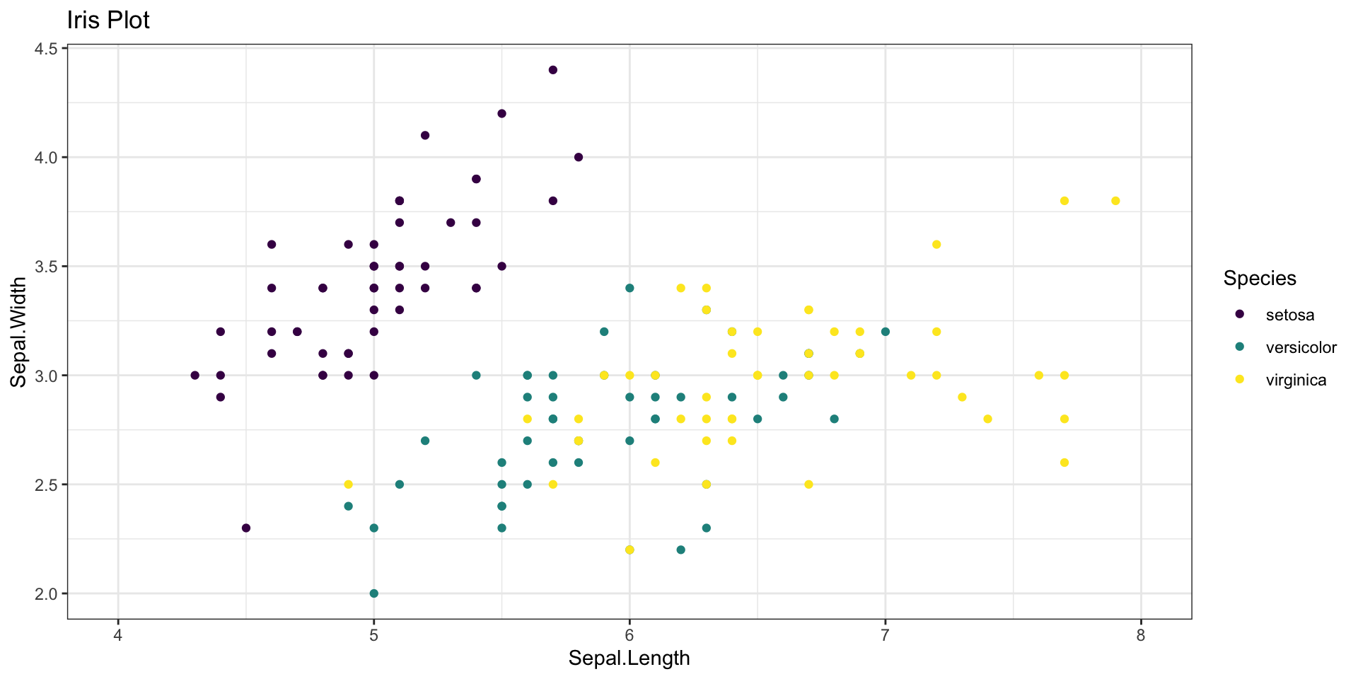
Layers
- Layers work together to plot elements
- Not all layers are necessary
- Each can have a powerful effect on outcome
ggplot(data = iris,                 # Data layer
       aes(x = Sepal.Length,        # Aesthetics
           y = Sepal.Width,
           color = Species)) +
  geom_point() +                    # Geometries
  stat_smooth(method = "lm") +      # Statistics
  #scale_color_viridis_d() +         # Scale
  #coord_cartesian(xlim = c(4, 8)) + # Coordinates
  facet_wrap(~Species) +            # Facets
  #theme_bw()                        # Theme
  labs(title = "Iris Plot")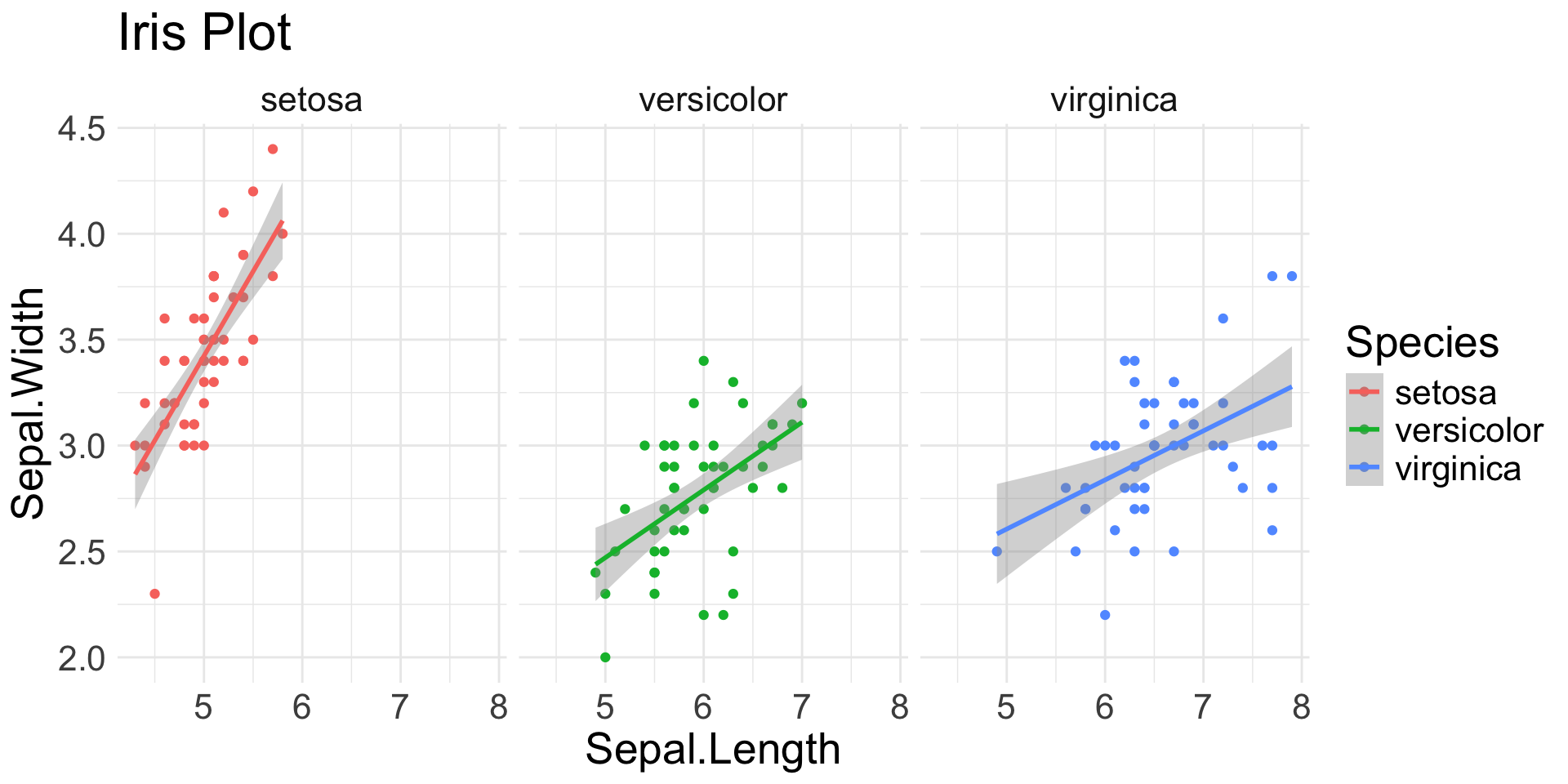
Spot the aesthetics (2/4)
Spot the aesthetics (3/4)
Spot the aesthetics (4/4)
Geoms
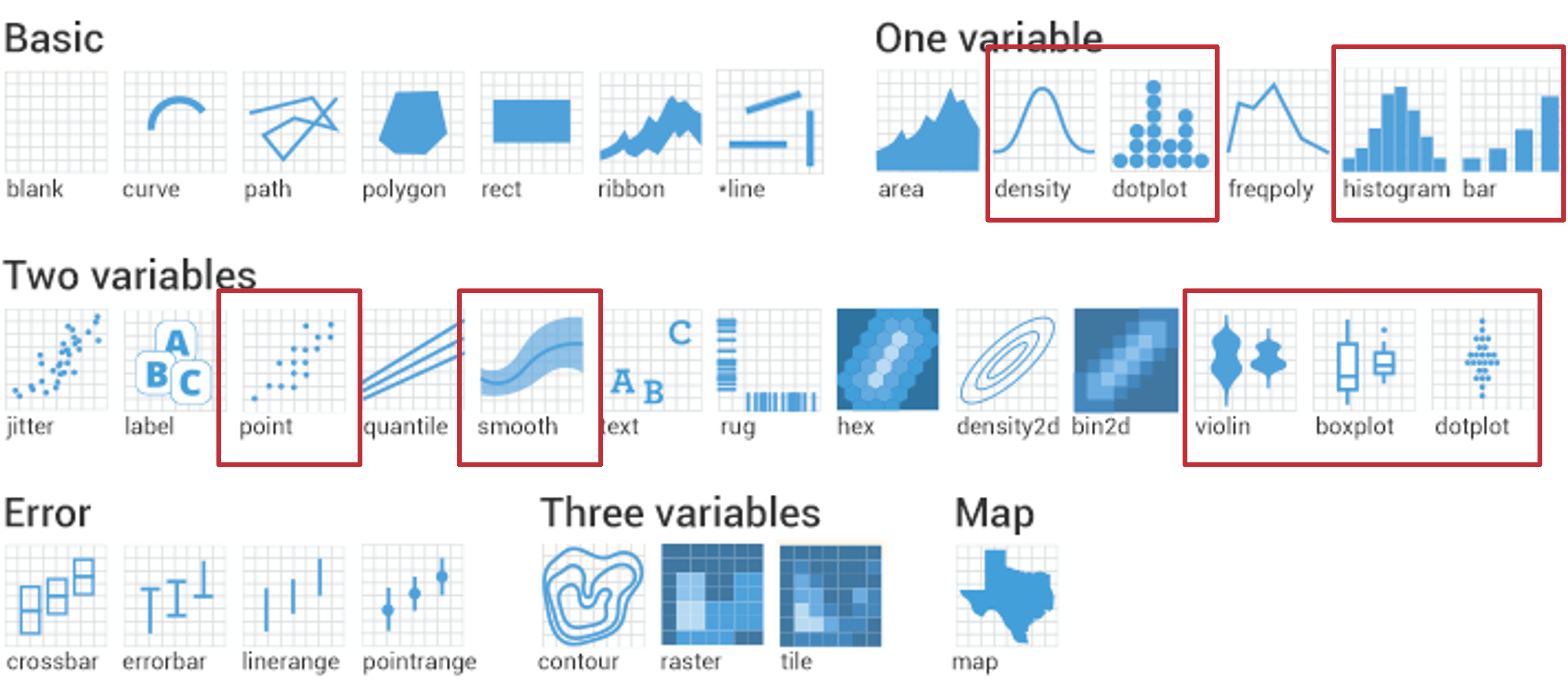
1 Continuous Variable
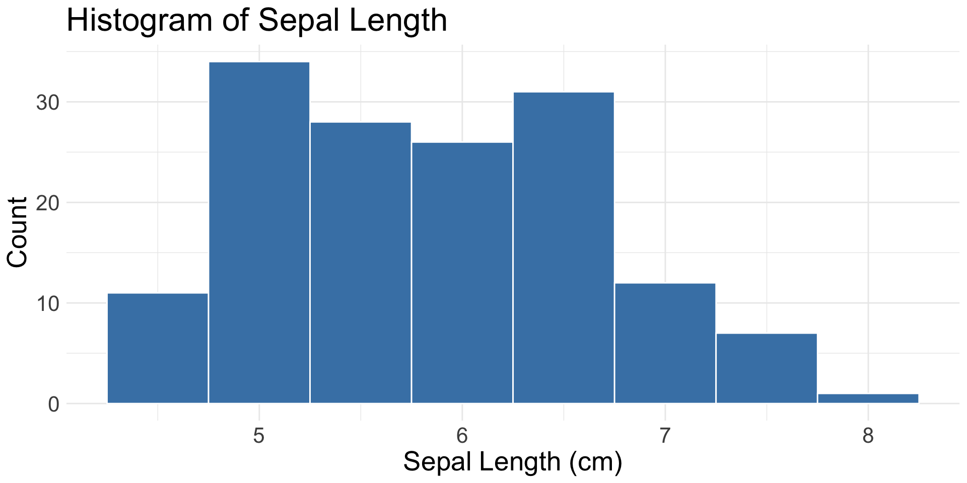
geom_histogram(): binned distribution
1 Continuous & 1(+) Categorical Variable
geom_boxplot(): distribution with quartiles and outliers
1-2 Categorical Variables
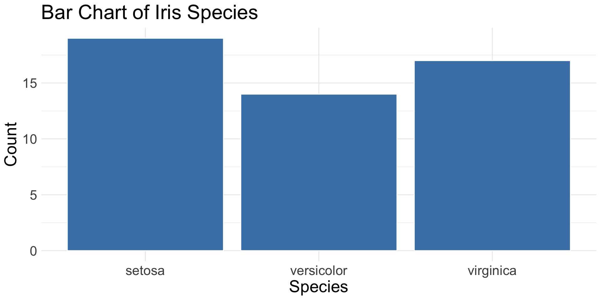
geom_bar(): count of observations in each category
geom_col(): height of bars based on pre-summarized data
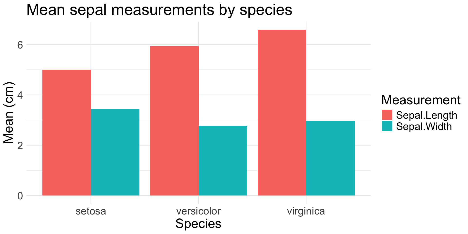
iris |>
  pivot_longer(
    cols = starts_with("Sepal"),
    names_to = "Measurement",
    values_to = "Value"
  ) |>
  group_by(Species, Measurement) |>
  summarise(Value = mean(Value),
            .groups = "drop") |>
  ggplot(aes(x = Species, y = Value,
             fill = Measurement)) +
  geom_col(position = "dodge") +
  labs(
    title = "Mean sepal measurements by species",
    x = "Species",
    y = "Mean (cm)"
  )
2+ Continuous Variables
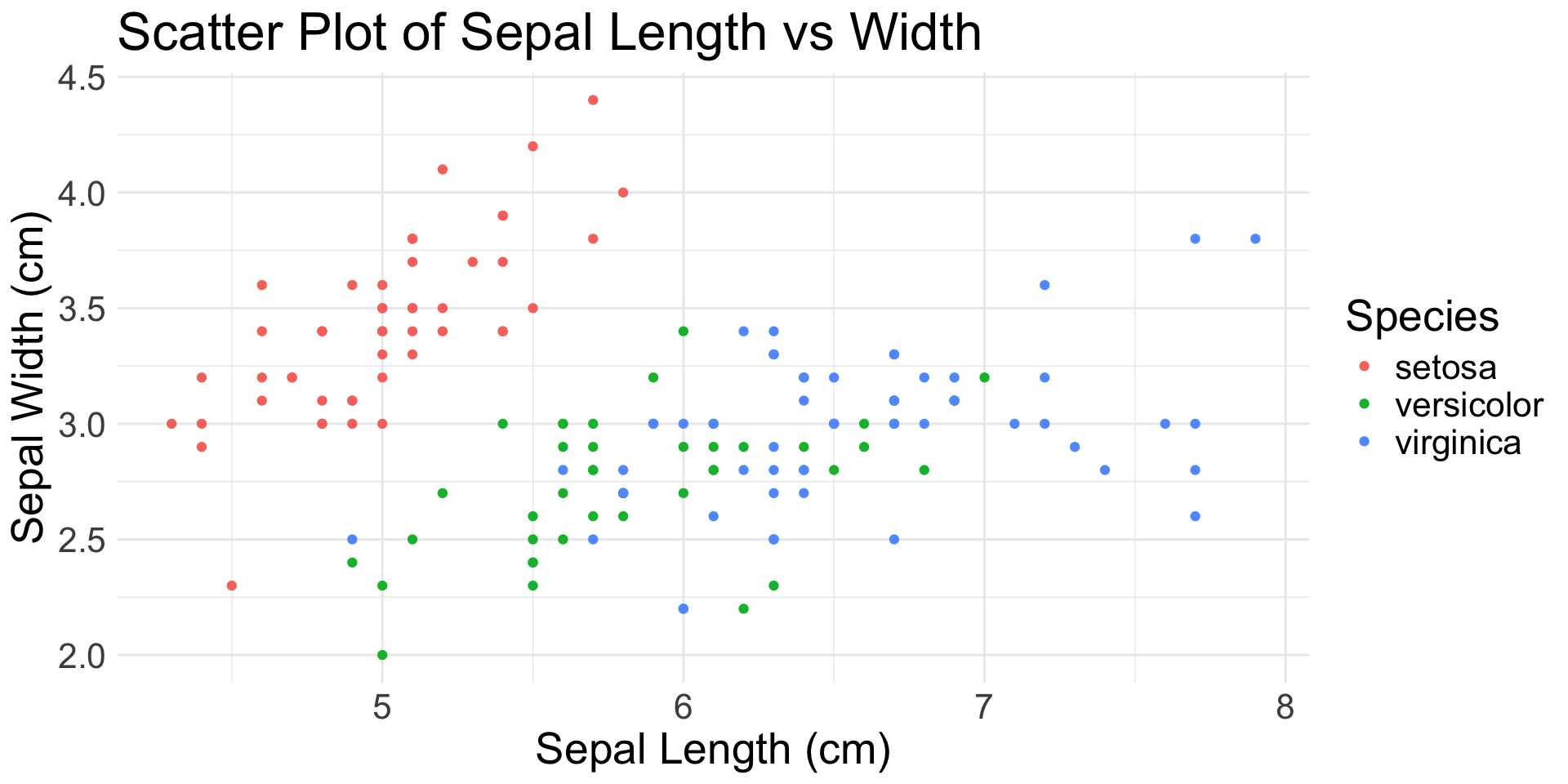
geom_point(): scatter plot
geom_jitter(): scatter plot with random noise
geom_smooth(): smoothed mean (e.g., regression line)
2+ Ordered Variables
geom_line(): connects observations in order